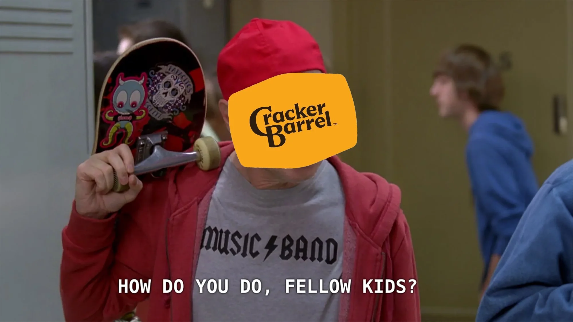
From Nostalgia to Nothing: Breaking Down Cracker Barrel’s Logo Controversy
According to some, Cracker Barrel just dropped roughly $700 million on a rebrand. The goal? Modernization. The result? A brand that feels like it scrubbed away its own soul.
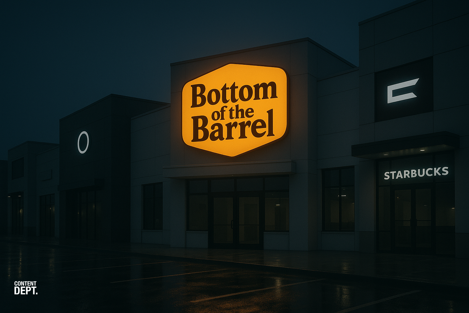
The new logo strips away the iconic man and barrel, leaving a flat, text-only design that looks more “Millennial Grey” than “Old Country Store.” It feels like they looked at what Bob Evans was doing and somehow made it worse. Add in the store redesign with cheap white paint, clean lines, and textures that feel cold instead of comforting, and you’re left with a chain that’s lost the very thing that made it unique.
Cracker Barrel used to feel like your grandparents’ dining room in 1992. It had personality. You could be off a major highway, across from a Sam’s Club, but walk inside and feel like you were in Amish Country. That was the magic. Nostalgia wasn’t just part of the brand, it was the brand.
And they threw it away.
When you look at McDonald’s, Wendy’s, or Pizza Hut today compared to the experience they offered 20 years ago, you see the same story. Each of them ripped away what made them, them. Character and identity replaced with minimalism and sterile interiors. Cracker Barrel has now joined that club, scrubbing away its identity in exchange for clean lines and corporate sameness. It’s the Hollywood approach: beat the same lifeless formula to death. Just like movie studios recycling franchises, restaurants are now gutting their uniqueness for the cheapest makeover possible.
The Cost of Ignoring Nostalgia
This wasn’t just a branding misstep. It had a real financial impact. Cracker Barrel’s stock dropped hard after the rebrand announcement:
Shares fell 7.2% in a single day, erasing nearly $94 million in market value.
Overall, the stock tumbled 11–12% in the days following the backlash.
Over the course of a week, the losses deepened to around 16.5%, one of the company’s worst stretches in recent memory.
That’s not just bad design. It’s tangible financial damage. Stripping away identity didn’t just upset customers. It rattled investors too.
What Other Brands Got Right
The difference is that brands like Coca-Cola and McDonald’s have also found ways to win by leaning into nostalgia. Coca-Cola’s retro packaging campaigns and McDonald’s viral “Grimace Shake” moment proved that reminding people of shared memories can drive real engagement and sales. Cracker Barrel had that same emotional equity sitting in its lap, but instead of embracing it, they stripped it away. They could have launched a nostalgia-driven campaign that celebrated comfort and tradition. Instead, they gave people a cold rebrand that no one asked for.
Was Cracker Barrel forgotten by the next generation of diners? Sure. But instead of leaning into what made them memorable in the first place, they doubled down on becoming generic. They didn’t need a new logo or cold interiors. They needed a campaign that reminded people of what they already loved: a familiar place with consistent, familiar food. Comfort, not minimalism.
What we’re watching here is another example of how originality and personality die in the name of corporate “modernization.” And when you spend $700 million to flop this hard, it’s not just bad design. It’s a failure to understand the value of identity itself.
Look. At the end of the day, none of us were really frequenting Cracker Barrel. Which is why they felt the need to do something. The issue here is they did it wrong. This topic will sizzle out and in my opinion, Cracker Barrel will ride off into the sunset after what will likely be a lengthy series of VC acquisitions before being dissolved. We are all in an uproar over something that we honestly don’t care that much about. We just don’t like change. Especially when it’s shitty.